Brand Guidelines
The work of branding is the art of breaking expectations.
Kentland’s brand is experienced through typography, color, shapes, and tone-of-voice in communications. When all of these elements come together, they assist in enhancing one’s quality of life.
Kentland’s DNA represents the core values of the town and serves as the foundational building blocks to the brand.
They reflect how the residents feel about living in Kentland. The Pillars are an outward expression of the DNA, and each one complements its own respective DNA point. Together, they serve as the bridge to Kentland’s brand positioning statement for Kentland.
Address
300 N. 3rd St.
Kentland, IN 47951
Phone
Tel: (219) 474-5062
info@kentland.in.gov
Brand Guidelines
Have Questions?
300 N. 3rd St.
Kentland, IN 47951
Phone
Tel: (219) 474-5062
info@kentland.in.gov
DNA
Quality
We take pride in our great quality of life, enjoying friends, family, casual recreation, and outdoor activities. Our top-notch school system, beautiful downtown, and parks are just a few of the amenities that make our residents so happy.
Community
Possessing a strong Midwest identity, Kentland is a small, welcoming, and affordable town to live and raise a family in. Our community maintains a close-knit atmosphere and takes great pride in caring for each other.
Dedicated
Long-time residents, businesses, and our local government are focused on forging a bright future for Kentland. This ongoing investment is part of who we are.
Pillars
Safe
We’re welcoming and highly value our town’s security. Our people take care of each other and offer a helping hand, especially in times of need.
Friendly
Our community is known for its friendliness, and we support our town’s values through a kind and generous spirit.
Driven
Long-time residents, businesses, and our local government are focused on forging a bright future for Kentland. This ongoing investment is part of who we are.
Tone of Voice
Our voice expresses a sense of:
Brand Positioning Statement
Kentland’s mission as a brand is summed up in a concise statement that’s driven by its DNA & Pillars.
Colors
Our Colors Bring Life and Consistency.
When using the color palette below, the amount of any specific color within a given layout is important to consider. Layouts will consist of the primary colors Grass, Glow,and Noon. Layouts may also consist of the secondary colors Moss, Sprout, and Sun.
Primary
Grass
CMYK
C:83 M:0 Y:72 K:43
RGB
R:0 G:116 B:79
Hex
#00744F
Pantone
3415C
Primary
Glow
CMYK
C:0 M:82 Y:95 K:0
RGB
R:241 G:86 B:41
Hex
#F15629
Pantone
021C
Primary
Noon
CMYK
C:0 M:19 Y:91 K:0
RGB
R:255 G:205 B:46
Hex
#FFCD2E
Pantone
123C
Secondary
Moss
CMYK
C:60 M:0 Y:72 K:0
RGB
R:107 G:192 B:119
Hex
#6BC077
Pantone
7479C
Secondary
Sprout
CMYK
C:27 M:6 Y:72 K:0
RGB
R:192 G:207 B:110
Hex
#C2CF6E
Pantone
374C
Secondary
Sun
CMYK
C:10 M:53 Y:100 K:0
RGB
R:226 G:138 B:38
Hex
#E28A26
Pantone
158C
Logos
Growing Stronger Everyday.
The strongest shape in nature is the triangle — which is representative of strength, robust pride and security. This, coupled with Kentland’s beautiful sunrises and sunsets, forges a solid foundation that’s symbolic of our community’s ability to grow stronger everyday. The typography used for Kentland’s name is bold, inviting and positive — making the brand functional and expressive.
Unacceptable Logo Configurations.
When it comes to brand recognition and professionalism, the logo should never be altered outside of the previous logo specifications.
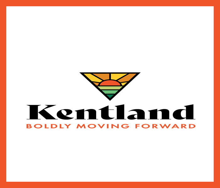
Skew, distort or rotate
Do not skew the logos.
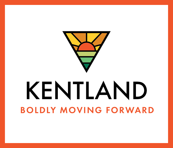
Text and typeface
Do not replace the typefaces.
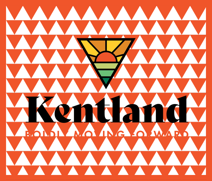
Busy areas of texture
Do not use over busy textures.
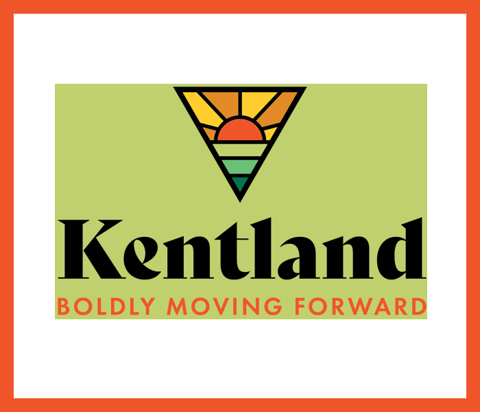
White or colored boxes
Do not isolate the logo in a small box.
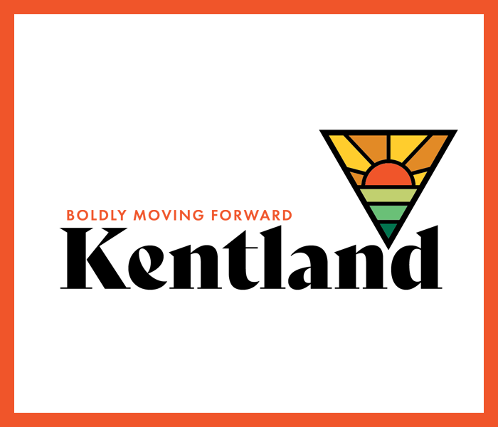
Relative positioning
Do not reposition any elements.
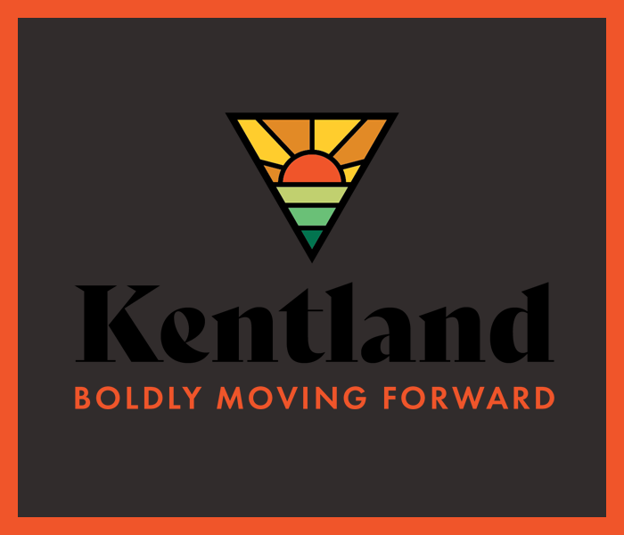
Hue and tone
Do not use clashing colors.
Typography
A Lively Font System.
An inviting, bold, and positive narrative expresses Kentland’s community values while forging a brighter future each day.
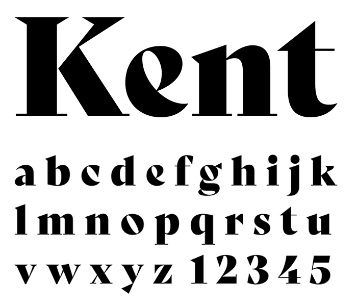
Primary Headlines
Bely Display
Use these selected fonts and weights for all print and web collateral. By adhering to these guidelines a unique and consistent look is created. Consistency is key, never use any fonts other than the Bely family.
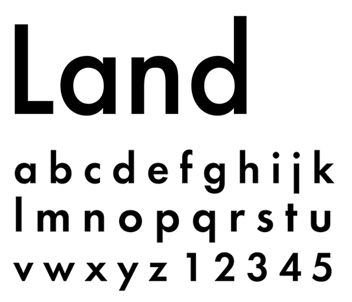
Secondary Headlines
Futura Pt
Use these selected fonts and weights for all print and web collateral. By adhering to these guidelines a unique and consistent look is created. Consistency is key, never use any fonts other than the Futura PT family.
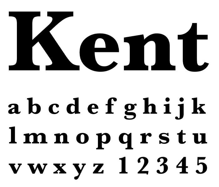
Alternative Headlines
Baskerville Bold
Use these selected fonts and weights for all print and web collateral. By adhering to these guidelines a unique and consistent look is created. Consistency is key, never use any fonts other than the Futura PT family.
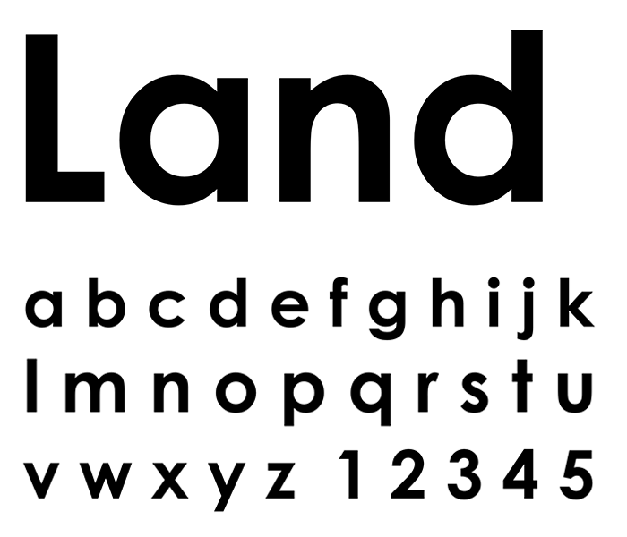
Alternative Headlines
Century Gothic
Use these selected fonts and weights for all print and web collateral. By adhering to these guidelines a unique and consistent look is created. Consistency is key, never use any fonts other than the Futura PT family.
Icons and
Patterns
A Versatile Identification System.
Town icons used in addition to the logo are meant to express and identify numerous integral parts of Kentland. Although our primary logos are most commonly used — these icons are versatile, consistent, and help engage people who are interested in a particular aspect of the community.
Schools
Library

Community Center

Agriculture
Airport
Townhall
Industry
Courthouse
Parks
Public Works
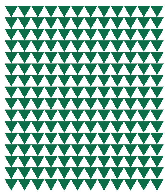
Patterns
Textured patterns can bring life to simple logos and help create memorable brand expressions. These elements are generally not presented front and center in our designs, yet they play a vital role in creating strong brand recognition. Some patterns are highly contrasted against the background and others are used as a subtle texture.


Photos
Imagery Guidelines
Reflective of the town’s character — jovial families,verdant landscapes and small businesses are captured in a flash at the heart of Kentland.
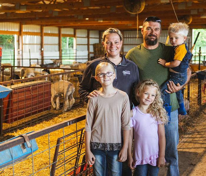
Our Imagery is a Warmhearted Experience
Lifestyle
We strive to use a diverse spread of family oriented photos which are symbolic of the
great quality of life in Kentland — while selecting imagery that is targeted towards the
copy and design of any marketing goal. Our family imagery must be welcoming, kind,
adventurous, playful, and inspiring. Avoid overly staged and blatantly stock imagery.
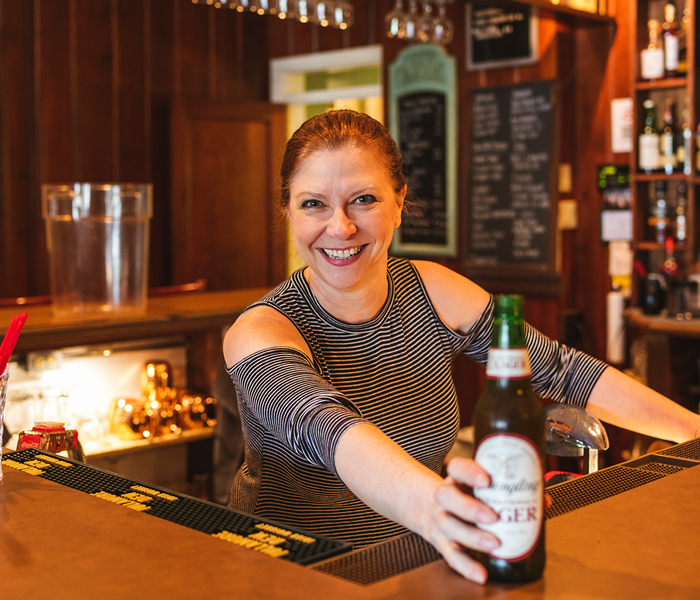
Our Imagery is a Driven Experience
Business
We strive to use a diverse spread of small business photos which are symbolic of Kentland’s legacy of hard work — while selecting imagery that is targeted towards the copy and design of any marketing goal. Our business imagery must be relatable, rural, professional, industrial, unique, skillful, and motivational. Avoid overly staged and blatantly stock imagery.
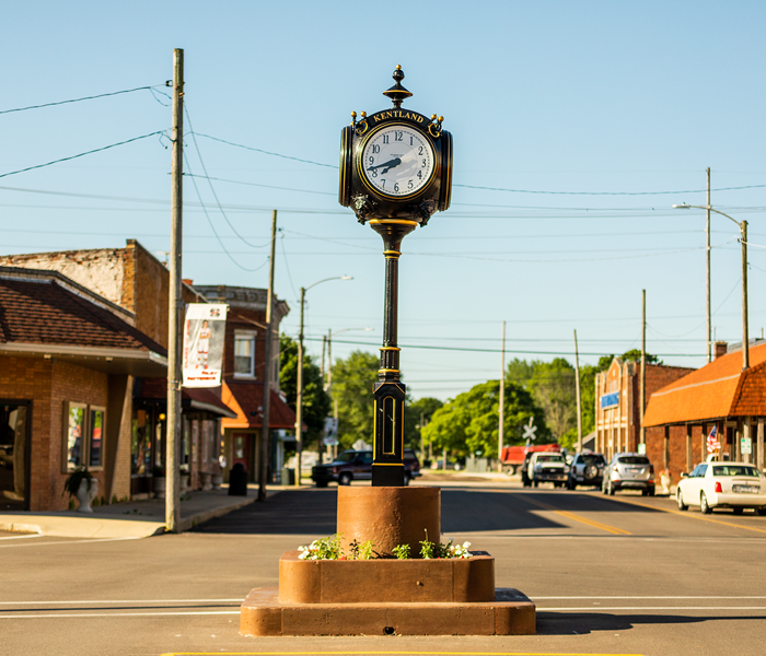
Our Imagery is a Warmhearted Experience
Key Assets
We strive to use a diverse spread of small business photos which are symbolic of Kentland’s legacy of hard work — while selecting imagery that is targeted towards the copy and design of any marketing goal. Our business imagery must be relatable, rural, professional, industrial, unique, skillful, and motivational. Avoid overly staged and blatantly stock imagery.

Our Imagery is a Warmhearted Experience
Headshots
We strive to use a diverse spread of small business photos which are symbolic of Kentland’s legacy of hard work — while selecting imagery that is targeted towards the copy and design of any marketing goal. Our business imagery must be relatable, rural, professional, industrial, unique, skillful, and motivational. Avoid overly staged and blatantly stock imagery.
Photo Misuses
We strive to prevent the misuse of photography by providing
simple guidelines. Staying in step with these tips will help create
a look-and-feel that’s authentic to Kentland’s brand.

Skew, distort or rotate
Do not skew the photos.

Photo filters
Do not add filters to the photos.

Stock Imagery
Do not use obvious stock photos.

White backgrounds
Do not use photos with blank white backgrounds.

Photo outlines
Do not add outlines to the photos.

Selective coloring
Do not selectively color photos.


